Revamping an NGO's landing page to persuade users to donate and help them make informed choices.
View PrototypeFoods For Jobless (FFJ) is a non profit offering aid to afflicted communities in Bali, Indonesia, in the wake of the COVID-19 induced ban on tourism.
In the short term, FFJ’s initiatives supply basic human needs such as food and clean water. In the long term, they aim to create a circular economy and expand their initiatives to aid the entire Balinese community.
To support their initiatives, FFJ seeks donations from a broad audience who are well-acquainted with their values and initiatives. However, the current landing page makes it tedious to engage in information and donation. The website also lacks a distinct visual identity that can further persuade users. With that,

How might we revamp the FFJ landing page to persuade viewers to learn about Food For Jobless’ cause and initiatives and then donate?
Following the guiding question, I created a prototype that features a reordered content hierarchy, distinct visual identity, and persuasive visual tropes. In delivering easily-accessible information by a visually compelling narrative, a more persuasive call to action is established.


To identify what the solution should tackle, I arranged a structured interview with FFJ’s founder, Mr. Fanty Fang, and conducted 5 usability tests.
In an open-ended interview with Mr. Fanty Fang, I learned a lot about the Foods For Jobless organization's:
Intended Message and Outcome
Operations and Target Audience
Mission and Vision
Values
His responses are summed up in the empathy map below —

I conducted usability tests with 5 individuals new to the landing page, and garnered qualitative data regarding their:
First Impressions
Pain Points
Overall Experience
Sorting their comments and behaviors into Nielsen’s 10 usability heuristics reveals that the current design lacks in —
80% of users did not expect that the ‘About Us’ and ‘Our Projects’ headers were clickable. They opted to click on the items in the dropdown.

Users expressed discomfort at the amount of video embeds they had to scroll through.

The donate call to action is hard to find, with users having to scroll to the page footer.

The insights were translated into several design constraints, which aim to remedy the issues raised and enhance Foods For Jobless' appeal as a charitable organization.
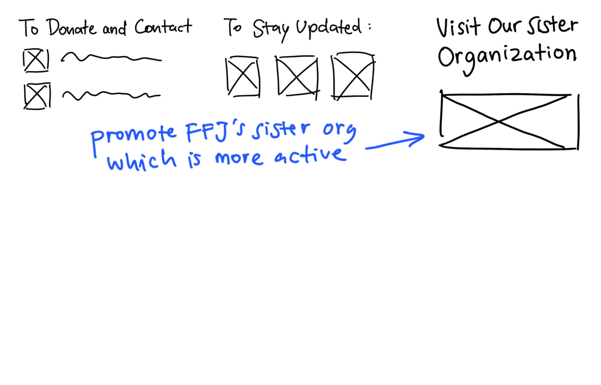
The content was reordered to prioritize FFJ's mission and profile, followed by their track record, and end with their donation call to action. This helps users understand why the organization does what they do and thus become compelled to assist them in doing so.
The dropdown header hyperlinks were disabled and new dropdown items were added to substitute them. This prevents user confusion and ensures access to desired information.


After reviewing competitor landing pages and sketching out several wireframe compositions, I arrived at several ideas to accommodate different user goals, promote digestion of and exposure to information, and generate increased interest.

Allows users to achieve information or donation from the beginning, but visually encourages them to select the ‘Learn More’ option.

Two new statistical statements reassure users of their donation’s impact, building trust.

Displays all projects with links to their individual sections in the "Initiatives" page. Visually encourages finding out about FFJ’s flagship project.

Displays all Youtube videos in a web player to make it concise and digestible,
Following the revised content hierarchy, I created wireframes to act as a visual foundation.

Description & Donate

Mission

Nasi Bungkus 2K Feature & Other Projects

YouTube videos & news articles

Virtual gallery
Donate & Socials
A visual identity was developed to convey the organization’s values of community and simplicity. Other communicated messages include hunger, warmth, circularity, and the strength of the Balinese community. For this, the recurring use of circular/rounded elements and hues of an orange variety were instrumental.

Visual rhetorical tropes are a clever way of conveying messages and the brand’s tone of voice to users. They also create avenues for cultural engagement and meaning. Several rhetorical devices were explored.

From these ideas, I developed several into hand drawn illustrations. These lend a sense of humanity, further accentuated by the brush texture that lends an organic quality.

A part is made to represent a whole
The hands represent humans and are depicted in acts of sharing and collaboration.
Exaggerated statements
A flag larger than the earth emerges from Bali pinpointing the birthplace of the world’s first ‘Nasi Bungkus 2K’ initiative.
An indirect reference to an object or idea
Sunglasses and a camera allude to tourism. The landscape silhouette alludes to the island of Bali.
This project challenged my tendency to rely on illustrations and photorealistic imagery, allowing me to explore typography and color as means of visual persuasion.
Working with a client was a valuable experience as it provided me with a solid design direction and challenged my design biases.
Designing for a cause I resonate with opened my mind to the potential of design to inspire the good of human nature.
Because this was an individual and design-heavy project, I hope to continue developing the design alongside developers and the client.
Making the design mobile-friendly is a top priority to grant potential donors ease of access.